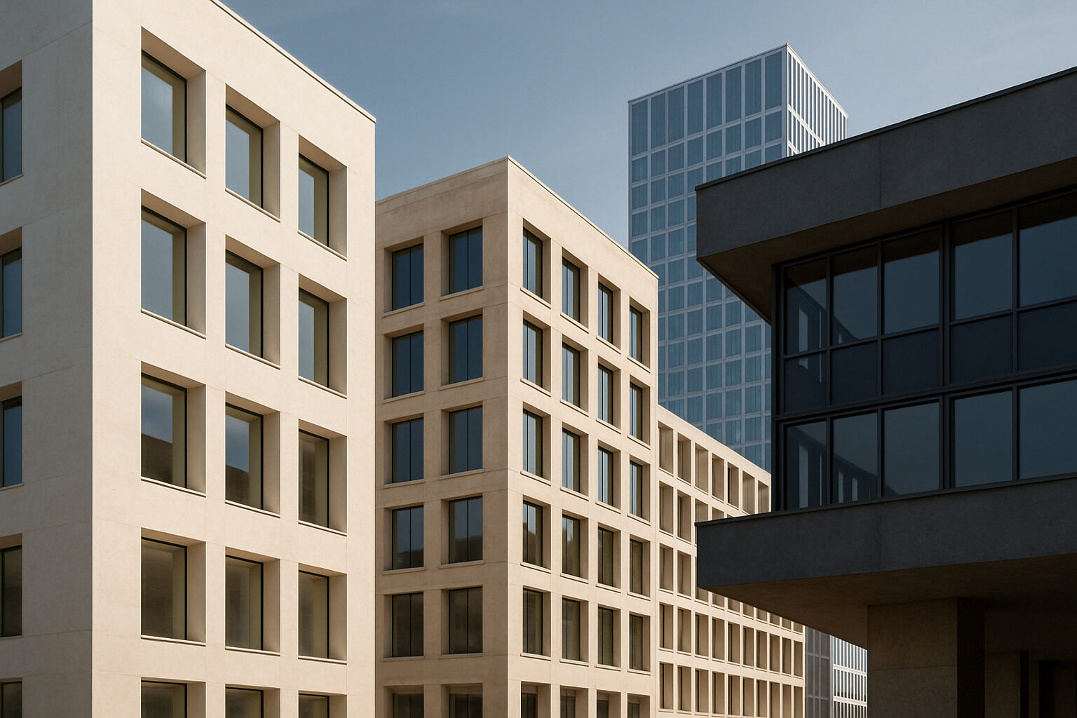
Architecture's design principles are the recurring rules of composition, balance, rhythm, hierarchy, scale and proportion, emphasis, contrast, and unity, that architects use to turn walls, windows, and rooms into coherent, satisfying buildings. They are not laws handed down by any single authority; they are patterns that designers across cultures and centuries have found reliably make buildings feel ordered, legible, and pleasant to be in.
This guide is a working reference to those principles. For each one, you will find a plain definition, why it matters, and how to recognize it in real buildings. Learn even three or four of them and you will never look at a street the same way again: facades stop being random and start reading as a series of deliberate moves.
Balance: Visual Weight in Equilibrium
Balance is the sense that a composition's visual weight is distributed so it feels stable rather than lopsided. It comes in two main flavors. Symmetrical balance mirrors elements around a central axis, think of a classical courthouse with an entrance in the middle and identical wings on either side. It reads as formal, calm, and authoritative, which is why civic and religious buildings have favored it for millennia. Asymmetrical balance achieves equilibrium with unequal elements: a large low mass on one side balanced by a tall slender one on the other. It reads as dynamic and informal, and it dominates modern residential design.
To spot it, imagine a vertical line through the middle of a facade and ask whether the two sides feel equally weighty, even if they are not identical. When a building feels vaguely uneasy, unbalanced massing is often the culprit.
Rhythm: Repetition and Pattern
Rhythm is the repetition of elements, columns, windows, arches, bays, at regular or varied intervals, giving the eye a beat to follow. A colonnade is pure rhythm; so is a row of identical townhouse fronts. Designers also compose more complex rhythms: alternating wide and narrow windows, or a pattern that accelerates toward an entrance.
Rhythm matters because buildings are big, and repetition is how large compositions stay comprehensible. It also creates movement: a strong horizontal rhythm pulls your eye, and your feet, along a street. Break the rhythm deliberately and you create an accent, which leads directly to the next principles.
Hierarchy: Signaling What Matters Most
Hierarchy is the arrangement of elements so that importance is instantly legible. The main entrance is bigger, more ornamented, or more central than side doors. The dome rises above the wings. The lobby is taller than the corridors. Without hierarchy, a building becomes a puzzle: visitors cannot find the door, and no space feels special because every space claims equal attention.
Architects create hierarchy through size, placement, shape, and detail. A useful exercise is to glance at any public building and ask what your eye lands on first, then second, then third. In a well-designed building that sequence matches what the architect wanted you to value: entrance, then principal rooms, then supporting fabric.
Scale and Proportion: Size Relationships That Feel Right
These two are cousins but not twins. Scale describes a building's size relative to something outside it, usually the human body or neighboring structures. A cathedral is monumental in scale on purpose; a cottage is intimate in scale on purpose. Problems arise when scale is accidental, like a bulky building looming over a fine-grained street.
Proportion describes size relationships within the composition: the ratio of a window's height to its width, or a column's thickness to its height. Classical architecture built elaborate proportional systems around the column orders, and many traditions have prized particular ratios for their harmony. You do not need the math to use the concept: when a facade's openings all seem to belong to the same family of shapes, disciplined proportion is usually why.
Emphasis and Contrast: Creating Focal Points
Emphasis gives a composition a focal point, one element that dominates, such as a tower, a grand stair, or a boldly framed doorway. Contrast is a chief tool for achieving it: rough against smooth, glass against masonry, a curved form amid straight ones, new construction set against historic fabric. Used sparingly, contrast makes both parties look better; used everywhere, it collapses into noise. A good rule of thumb from practice: a building can carry one or two strong moves, and the rest of the composition should support them quietly.
Emphasis also has a practical job beyond beauty: it is how buildings communicate. A clearly emphasized entrance tells strangers where to go without a sign. A tower marks a civic building from blocks away. When emphasis is missing, buildings become confusing; when it is misplaced, say, a garage door dominating a house front, the building announces the wrong priorities. Reading emphasis critically is one of the quickest ways to judge whether a design is merely decorated or genuinely composed.
Unity and Variety: The Master Balance
Unity is the sense that everything in a building belongs together, achieved through a consistent palette of materials, a limited family of shapes, and repeated details. Variety is the differentiation that keeps unity from becoming monotony. Nearly every other principle serves this final balancing act: enough order to feel coherent, enough incident to stay interesting. Styles are essentially reusable recipes for that balance, which is why studying them is such a fast way to learn composition; our beginner's guide to building styles is a good companion here, as is the deeper modernism entry in our style library if you want to see how radically one era rewrote the recipe.
The Principles at a Glance
| Principle | Core idea | Quick way to spot it |
|---|
| Balance | Visual weight in equilibrium | Compare the two halves of a facade |
| Rhythm | Repetition creates a visual beat | Count window and column spacing |
| Hierarchy | Importance made visible | Note what your eye finds first |
| Scale | Size relative to people and context | Compare the building to a person at the door |
| Proportion | Harmonious internal ratios | Check if openings share a family of shapes |
| Emphasis and contrast | A deliberate focal point | Find the one element that dominates |
| Unity and variety | Coherence without monotony | Ask if parts feel like one composition |
Putting the Principles to Work
Principles become intuitive only through use, so here is a simple practice routine. Choose one building a day, a photo works fine, and audit it against the table above: where is the balance axis, what is the rhythm, what carries the emphasis? Then check your reading. Upload the photo to our AI building analysis tool and compare its breakdown of styles and elements with your own. If you would rather discover which principles you personally respond to, the style finder quiz reveals your leanings through a series of visual choices.
The payoff of learning these basics is not jargon; it is perception. Balance, rhythm, hierarchy, scale, proportion, and unity are the levers behind nearly every building you admire, and once you can name the levers, you can appreciate, critique, and even design with far more confidence.