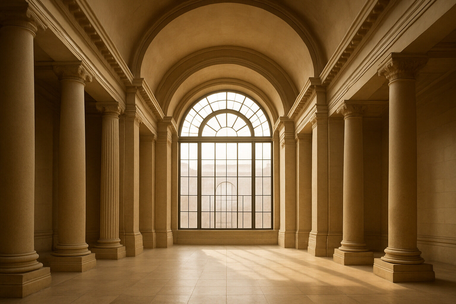
Proportion is the quietest tool in architecture and the most emotional. Before you register a building's style, color, or ornament, your visual system has already measured its relationships — the height of the ceiling against the width of the room, the window against the wall, the column against the facade — and translated those ratios into feeling: intimate or imposing, serene or unsettling, generous or mean. Emotional design through proportion is the deliberate use of those relationships to produce an intended experience, and it has been the working method of great architects for at least two and a half millennia.
This article looks at how proportional systems like the golden ratio actually operate on our emotions, why ceiling height changes how we think, how scale communicates power and welcome, and how to apply proportional thinking to real spaces.
Why Ratios Reach Us Before Reasons Do
Human perception is relational. We do not experience a twelve-foot ceiling as twelve feet; we experience it as tall for this room, in this proportion to that width, relative to our own body. Because the measuring is automatic, the emotional result feels like a property of the space itself — a room simply is oppressive or noble, and we rarely trace the feeling to its dimensional source. That invisibility makes proportion a uniquely powerful emotional instrument: it persuades without appearing to argue.
Research in environmental psychology broadly suggests that spaces with coherent, consistent proportional relationships are perceived as more pleasant and more beautiful than dimensionally arbitrary ones, and that this holds even when viewers cannot articulate what differs. The emotional content, in other words, is carried by the ratios themselves. This is the terrain we map more fully in the psychology of architectural aesthetics.
The Golden Ratio and Its Cousins
The most famous proportional system is the golden ratio — roughly 1 to 1.618 — a relationship in which the smaller part relates to the larger as the larger relates to the whole. Its self-similarity gives compositions a nested harmony that many designers find inexhaustibly useful, and Renaissance architects made it and other mathematical ratios central to a whole theory of beauty, which we unpack in the golden ratio in Renaissance architecture.
Honesty requires two caveats. First, claims that famous buildings like the Parthenon were explicitly designed on the golden ratio are contested; the ratio can be found almost anywhere if you draw the rectangles generously. Second, perception studies have not shown that people reliably prefer golden rectangles over similar ones. What the evidence does support is subtler and more useful: committing to some consistent proportional discipline — golden section, musical ratios, a repeating module — produces the coherence our eyes reward. The specific system matters less than the fidelity with which it is carried through, from the massing down to the window muntins.
Ceiling Height: The Vertical Emotion
No single dimension shapes feeling more directly than ceiling height. Low ceilings compress space around the body and read as shelter: intimate, warm, and focusing at their best, confining at their worst. High ceilings release the body's envelope and read as freedom: expansive, formal, and inspiring at their best, cold and impersonal when overdone. Research broadly suggests these responses extend to cognition — higher ceilings are associated with more abstract, expansive thinking, lower ones with more focused, detail-oriented processing — which matches most people's intuition about where they daydream and where they concentrate.
Master architects orchestrate height as sequence rather than choosing one value. Frank Lloyd Wright's celebrated compression-and-release entries push visitors through deliberately low vestibules so that the main room's height lands as an emotional event. Gothic builders ran the logic to its limit: soaring naves, sometimes exceeding forty meters at Beauvais, were engineered explicitly to overwhelm — verticality as theology. Baroque designers added drama by alternating compressed and explosive spaces along a processional route, a repertoire you can explore in our Baroque style guide.
Scale: Proportion Between Building and Body
Where proportion relates a building's parts to each other, scale relates the whole to the human body — and scale is architecture's plainest emotional speech. Monumental scale communicates power, permanence, and the smallness of the individual; that is why states, churches, and corporations have always reached for it. Human scale — doors, sills, steps, and details sized to the body — communicates welcome and belonging. Neither is inherently good: a courthouse that felt like a cottage would undermine the seriousness of law, and a cottage that felt like a courthouse would be absurd.
The emotional failures come from mismatch. Environments scaled to cars and construction economics rather than pedestrians — blank podiums, endless unbroken facades — leave people feeling irrelevant, because at the level of bodily perception they are. The traditional remedy is layered scale: a large building that steps down through middle-scale elements (bays, arcades, balconies) to small-scale detail at the sidewalk, so the structure addresses the skyline and the passerby at once.
Rhythm: Proportion Repeated in Time
Proportion has a temporal dimension too. A facade is not seen all at once by a moving pedestrian; it is experienced as rhythm — window, pier, window, pier — and the ratio between solid and void sets the tempo. Closely spaced vertical elements create a quick, energetic beat; long horizontal bands create a slow, reposeful one. Classical colonnades, Gothic bays, and modernist ribbon windows are all rhythmic instruments, and each produces a distinct emotional pace in the person walking past. Interiors work the same way: a procession of identical arches builds anticipation toward whatever terminates the axis, which is why basilicas, mosques, and grand hotel corridors all use repetition to charge their destinations with importance. When a streetscape feels boring or relentless, the culprit is usually rhythm — either no beat at all, or a beat too long for walking speed.
Proportional Moves and the Feelings They Produce
| Move | Typical emotional effect | Where you see it |
|---|
| Low, wide rooms | Intimacy, shelter, informality | Cottages, snugs, Wright's living rooms |
| Tall, narrow volumes | Awe, aspiration, solemnity | Gothic naves, memorial voids, atria |
| Compression then release | Drama, arrival, gratitude for space | Low entries opening to great rooms |
| Consistent module throughout | Calm, unity, quality | Georgian facades, classical temples, good modernism |
| Monumental scale | Reverence — or alienation | Capitols, cathedrals, corporate towers |
| Layered human scale | Welcome, walkability | Traditional main streets, arcaded frontages |
Putting Proportion to Work
You do not need a cathedral budget to design with proportion. In any room, three questions unlock most of the emotional value. First, what is the ceiling asking the room to feel — and does the room's use agree? A dining nook wants compression; a studio wants release. Second, do the openings answer to a shared module, or is every window an independent decision? Aligning heads, sills, and widths to a simple system delivers coherence almost for free. Third, where does the space address the body — and are handles, rails, steps, and seats proportioned to it? Detail scale is where generosity is actually felt.
Then train your eye on the masters. Photograph a building whose feeling you admire and run it through our AI building analyzer to see its proportional and stylistic devices identified explicitly. Once you can see ratios doing emotional work, you will never again mistake proportion for a technicality — it is the grammar in which architecture speaks feeling.
See these ideas on a real building
Upload a photo or type an address and get an instant AI architecture analysis. Your first is free, no account needed.
Analyze a Building Free