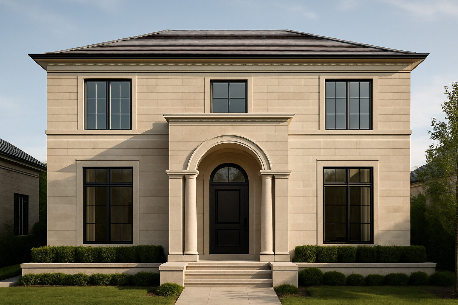
New classic design — often called modern classic or transitional classicism — pairs the proportion, symmetry, and detail of traditional architecture with the clean lines, open plans, and restrained palettes of modern design. A new classic home might have a symmetrical facade, a paneled entry, and crown moulding, but the mouldings are simplified, the colors are quiet, the windows are generous, and the interior flows like a contemporary house. The goal is a home that feels established and calm rather than trend-driven — classical bones, modern ease.
This guide explains the principles behind the style, walks through how to design a new classic home from massing to materials, and covers the current trends shaping the look.
What Makes a Home "New Classic"?
Three commitments define the style:
- Classical order: symmetry, hierarchy (a clearly emphasized entry), vertically proportioned windows, and consistent alignment between floors. These rules descend from the classical tradition — the same lineage covered in our Neoclassical style guide.
- Modern reduction: ornament is simplified rather than eliminated. Cornices, casings, and paneling are present but flattened and cleaned of small-scale decoration; columns may become square piers; a pediment may reduce to a simple gable with crisp trim.
- Contemporary living: open or semi-open plans, large glazed openings at the rear, integrated kitchens, and modern performance (insulation, lighting, technology) hidden inside the traditional envelope.
The style is distinct from strict period reproduction on one side and minimalism on the other; it borrows discipline from the first and calm from the second.
Start with Proportion and Massing
Classical architecture is, above all, a system of proportion, and this is where new classic design starts. Keep the main volume simple — a rectangular block with a gable or hip roof — and let secondary volumes (garage, wings) step down in height and depth so the hierarchy is legible. Center the entry, or balance an off-center entry deliberately. Windows should be taller than they are wide, aligned in vertical stacks and horizontal rows, with consistent head heights. Classical designers historically relied on ratio systems to relate every part to the whole; for a deeper dive into that thinking, see our post on the golden ratio in Renaissance architecture. You need not follow any ratio mystically — the practical lesson is consistency: pick a small set of dimensions and repeat them everywhere.
Simplify the Classical Vocabulary
The signature move of modern classicism is subtraction with respect. Guidelines that keep the details convincing:
- Flatten, don't erase. Use a simple two- or three-part cornice instead of none; use square-edged window casings of generous width instead of skinny modern trim.
- Keep the logic of load. Classical detail narrates structure — a lintel over an opening, a base under a column. Simplified versions should still sit where structure would be; freely floating ornament breaks the spell.
- Limit the palette of elements. One column type, one casing profile, one or two window formats. Repetition is what reads as classical.
- Invest at the entry. A well-proportioned door surround — pilasters and a simplified entablature or pediment — does more for the whole facade than detail scattered everywhere.
Materials and Color Trends
Current new classic homes favor a quiet, tactile materiality: painted brick or lime-washed masonry, smooth stucco, natural stone at the base or entry, and standing-seam metal or slate-look roofing. Color palettes run to warm whites, greiges, soft blacks, and muted greens, usually with dark window frames or, more traditionally, slender white sash. Interiors continue the theme — plaster-look walls, white oak floors, unlacquered brass or aged bronze hardware, honed stone counters — favoring texture over pattern. Trend-wise, the style has absorbed several contemporary currents: black-framed steel-look doors opening classical rooms to gardens, minimalist kitchens wrapped in traditional paneling, and a general drift from cool gray palettes toward warmer, earthier neutrals.
Traditional, New Classic, or Contemporary?
| Aspect | Traditional classical | New classic / modern classic | Contemporary minimalist |
|---|
| Facade composition | Strict symmetry, full classical orders | Symmetry or balanced asymmetry, simplified orders | Free composition, abstract volumes |
| Ornament | Full mouldings, carved detail | Flattened mouldings, crisp trim, restrained detail | Little to none |
| Windows | Small-pane double-hung, shutters | Tall simplified sash or steel-look frames | Large fixed glazing, minimal frames |
| Plan | Compartmented rooms | Semi-open plan behind a formal front | Fully open plan |
| Palette | Period colors, varied materials | Warm neutrals, few materials, high texture | Monochrome, industrial materials |
Interior Design: The Modern Classic Room
Inside, the formula repeats at furniture scale. Architectural envelope first: generous baseboards, simple crown, and wall paneling (shaker-style or flat recessed panels) establish the classic frame. Furnish with a mix — clean-lined sofas alongside one or two genuinely traditional pieces, such as a bergère chair, a pedestal table, or an antique chest — so the room reads collected rather than staged. Symmetry around a focal point (fireplace, bed, console) supplies the classical calm; a restrained palette with layered texture supplies the modern one. Lighting is a favorite place for contrast: a sculptural contemporary fixture in a paneled room, or a classic lantern in a spare hall.
Common Mistakes to Avoid
Because new classic design lives in the balance between two traditions, it fails in predictable ways when the balance tips. Watch for these pitfalls:
- Skinny trim on classical forms. A symmetrical facade with narrow builder-grade casings reads cheap, not modern. Generous, simple trim is the style's foundation.
- Ornament without logic. Shutters too small to cover their windows, columns that support nothing, or pediments floating over blank wall undermine the classical grammar.
- Too many materials. Mixing stone, brick, two sidings, and heavy timber accents on one facade is a builder trend, not classicism. Two materials, three at most.
- Inconsistent window proportions. One horizontal picture window in a facade of vertical sash breaks the rhythm that makes the composition feel resolved.
- Cold minimalism inside classical walls. If every soft or aged element is stripped out, the result feels staged; the style needs a few pieces with history or patina.
Getting the Look on a Real Project
If you are building new, brief your designer with the three commitments above — proportion, simplified detail, modern plan — and collect precedent photos of facades whose window rhythm you like; rhythm matters more than any single feature. If you are renovating, the highest-leverage upgrades are usually windows (taller, aligned, better proportioned), a proper entry surround, unified trim, and a disciplined exterior palette. Before committing, preview the transformation: upload a photo of your home to our AI restyle tool and see it rendered in a modern classic direction within minutes. If you are still deciding whether your taste truly runs classic, transitional, or modern, our style finder quiz will narrow it down, and the architecture explorer can analyze homes you admire and tell you exactly which elements are doing the work.
New classic design endures because it solves a real tension: we want homes that feel current but not disposable. Classical proportion supplies the permanence; modern restraint supplies the freshness. Get those two in balance and the style takes care of itself.
See these ideas on a real building
Upload a photo or type an address and get an instant AI architecture analysis. Your first is free, no account needed.
Analyze a Building Free