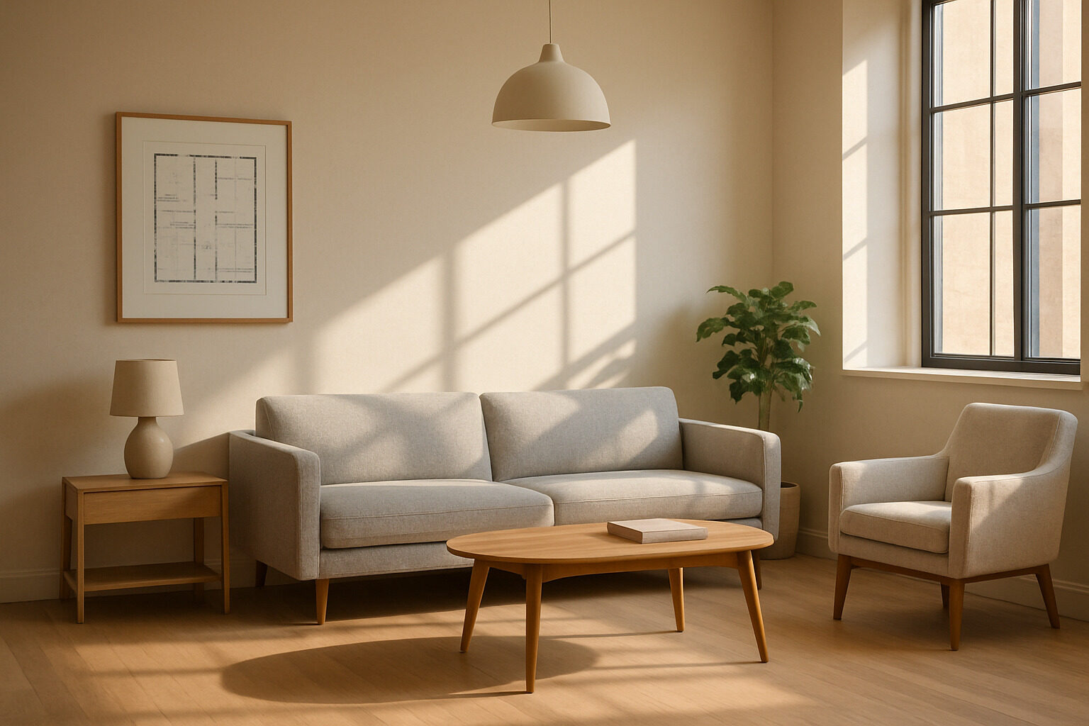
"Innendesign" — the German word for interior design — covers everything about shaping the inside of a home: layout, color, light, furniture, materials and the countless small decisions that make a room feel right. If you are just starting out, the sheer volume of advice online can be paralyzing. The good news is that professional interior designers rely on a surprisingly small set of fundamentals, and every one of them can be learned.
This guide distills those fundamentals into a beginner's toolkit: how to plan a room around function, build a color scheme that holds together, layer lighting properly, get furniture scale right, and use texture and materials to add depth. Master these essentials and you can decorate any room with confidence — no design degree required.
Start With Function, Not Furniture
The most common beginner mistake is starting with shopping. Professionals start with questions: Who uses this room, at what times, doing what? A living room for two remote workers who host monthly dinners needs a completely different plan than one for a family of five with a toddler.
Write down the top three activities the room must support, then plan zones for each. Every zone needs three things: a surface, a seat (or standing space), and light. A reading corner is a chair, a side table and a lamp; a home-office zone is a desk, a supportive chair and task lighting. Once the zones are mapped, circulation comes next: leave clear walking paths between doorways and between zones, and keep them free of furniture corners at shin height. A room that functions well already feels half-designed before you choose a single color.
Restyle your own space with AI
Upload a photo of your room or home and see it reimagined in any style from this article. Your first restyle is free, no account needed.
Restyle My Space
Build a Simple, Disciplined Color Scheme
Color is where beginners most often lose their nerve — or their discipline. A reliable framework is the classic proportional rule: a dominant color for roughly sixty percent of the room (walls, large rugs), a secondary color for about thirty percent (upholstery, curtains), and an accent for the remaining ten (cushions, art, ceramics). The exact percentages matter less than the hierarchy: one color leads, one supports, one sparkles.
Two practical tips make this easier. First, choose your palette from something you already love — a rug, a painting, a landscape photograph — rather than from abstract swatches; the colors in it are pre-harmonized. Second, test paint on the actual wall and watch it at morning, noon and night. Color changes dramatically with daylight direction, and the sample that looked warm in the shop can turn cold on a north-facing wall.
Layer Your Lighting
A single ceiling fixture is the fastest way to make a well-furnished room feel flat. Designers think in three layers:
- Ambient light — the general illumination of the room: ceiling fixtures, indirect coves, daylight.
- Task light — focused light for activities: a desk lamp, reading light, under-cabinet strips in a kitchen.
- Accent light — light as decoration and drama: picture lights, candles, a lamp glowing in a dark corner.
A comfortable room usually has light at several heights — ceiling, eye level, table level — and warm bulbs of consistent color temperature. Put the main lights on dimmers if you can; the ability to lower the room's energy in the evening is the cheapest luxury in interior design.
Get Scale and Proportion Right
Scale errors are the mistakes you can't unsee: the postage-stamp rug floating in a large room, the massive sectional strangling a small one, the tiny frame lonely on a broad wall. A few dependable guidelines prevent most of them. Rugs should be large enough that at least the front legs of surrounding furniture sit on them. Coffee tables work best at roughly two-thirds the sofa's length and near seat height. Art hangs at eye level — a common gallery convention centers it around 145 to 155 cm from the floor — and groups of small pieces read as one large piece if hung close together.
Before buying anything big, tape its footprint on the floor with painter's tape and live with it for a day. It is a five-minute exercise that has saved countless expensive returns.
Use Texture and Materials for Depth
When a room feels bland despite a good layout and palette, the missing ingredient is almost always texture. Rooms come alive through material contrast: rough against smooth, matte against glossy, hard against soft. A linen sofa next to a glass table, a wool throw over leather, a jute rug under lacquered chairs — each pairing creates the visual friction that makes an interior interesting even in a single color.
Natural materials — wood, stone, clay, wool, linen, rattan — are the safest investment because they age well and mix easily across styles. As a rule of thumb, aim for at least three distinct textures in every seating zone, and let one material repeat around the room to tie the composition together.
Style, Editing and Personal Expression
With the technical fundamentals in place, the last essential is editorial judgment: knowing what to leave out. Beginners tend to add — more cushions, more decor objects, more wall pieces — when most rooms improve by subtraction. A useful habit is the periodic edit: remove every small object from a room, then return only the pieces you genuinely love or use, grouping them in odd numbers and varying their heights. Empty surface is not wasted space; it is what lets the good pieces be seen.
Personal expression is what stops a correct room from feeling like a showroom. Books you have read, objects with a story, inherited pieces reupholstered in a modern fabric — these belong in the plan precisely because no algorithm or catalog can supply them. The fundamentals are the grammar; your possessions and preferences are the voice.
Beginner Priorities at a Glance
| Essential | Beginner mistake | What to do instead |
|---|
| Layout | Buying furniture first | Map activities and zones, then shop to fit |
| Color | Many equal competing colors | One dominant, one secondary, one accent |
| Lighting | Single overhead fixture | Three layers at multiple heights, dimmable |
| Scale | Undersized rugs and art | Tape footprints; size rugs to the furniture group |
| Texture | Everything smooth and new | Mix at least three materials per zone |
Find Your Style Before You Spend
The final essential is knowing your own taste well enough to say no. Styles are simply consistent sets of answers to the questions above — Scandinavian innendesign answers with pale wood and restraint, japandi with low forms and negative space, classic European with symmetry and molding. If you have not named your style yet, our Style Finder will identify it from a few preferences, and our overview of European architecture styles shows where many of these interior languages come from. Then, before committing to paint or purchases, photograph your room and preview whole directions with the AI restyle tool — seeing your actual space in a new style is worth a hundred moodboards. Start with function, stay disciplined with color, layer the light, respect scale, and layer texture: that is the entire foundation of good interior design. Everything else is refinement.
Restyle your own space with AI
Upload a photo of your room or home and see it reimagined in any style from this article. Your first restyle is free, no account needed.
Restyle My Space