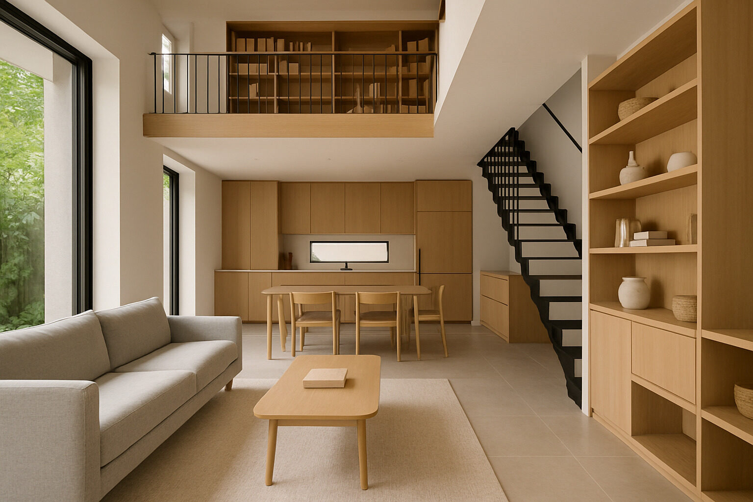
"Interiores casas" — Spanish for home interiors — is one of the most searched phrases in home design, and the question behind it is almost always the same: how do I make the space I have work harder and feel bigger? Whether you live in a compact urban apartment or a family house that never seems to have enough storage, space utilization is the discipline that separates homes that function beautifully from homes that merely contain furniture.
Good space utilization is not about cramming more in. It is about zoning rooms around real activities, exploiting the vertical dimension most homes ignore, choosing furniture that earns its footprint twice over, protecting circulation, and using light and sightlines so the space you have reads larger than its floor plan. This guide covers each of those strategies with practical steps you can apply to any home.
Zone First: Every Square Meter Needs a Job
The foundation of space utilization is knowing what each area of your home is for. Rooms fail when they accumulate functions by accident — the dining table that became a desk that became a storage shelf. Walk through your home and assign every zone a primary job and, at most, one secondary job. An open-plan living area might contain a conversation zone, a media zone and a work corner; a bedroom might be sleep plus reading, or sleep plus a compact wardrobe wall.
Once jobs are assigned, define zones physically without building walls: a rug anchors the seating area, a slim console marks where "living" ends and "dining" begins, a bookshelf placed perpendicular to a wall creates an instant study nook. Zoning also exposes waste. Corners, alcoves, the dead area behind a door, the space under a stair — each becomes a candidate for a reading chair, a built-in cabinet or a desk once you are looking for underused square meters instead of walking past them.
Restyle your own space with AI
Upload a photo of your room or home and see it reimagined in any style from this article. Your first restyle is free, no account needed.
Restyle My Space
Think Vertically: The Forgotten Dimension
Most homes use their floors intensively and their walls hardly at all. Vertical thinking is the fastest route to more capacity without more area:
- Full-height storage: wardrobes and shelving that run to the ceiling store rarely used items up high and eliminate the dusty gap on top of cabinets.
- Wall-mounted everything: floating desks, fold-down tables, mounted nightstands and TV walls free the floor, and visible floor area is what makes rooms feel large.
- The kitchen wall: rails, magnetic strips and open shelves move daily tools off precious counter space.
- Over-door and high shelves: a single shelf above a doorway adds a surprising amount of book or box storage in circulation areas that offer nothing else.
In rooms with generous ceiling heights, the vertical dimension can even yield whole functions: a sleeping loft, a raised platform with drawers beneath, or a mezzanine study.
Multifunctional Furniture: Make Every Piece Work Twice
In space-conscious interiors, furniture must justify its footprint with more than one job. The category has matured far beyond the creaky sofa bed: storage ottomans that hide linens, beds with hydraulic lifts over deep compartments, extending and drop-leaf tables that scale from two settings to ten, nesting side tables, desks that close into slim cabinets, and benches that store shoes at the entry while providing a place to sit.
Two rules keep multifunctional furniture from becoming a gimmick. First, the daily function must be excellent — a bad sofa that becomes a bad bed helps no one. Second, the transformation must be easy enough that you will actually do it; a table that takes ten minutes to extend will stay small forever. Choose fewer, better, harder-working pieces over many single-purpose ones.
Protect Circulation and Sightlines
Paradoxically, the way to make a small home feel bigger is to give space away — to movement. Clear circulation paths, ideally around 80 to 90 cm wide for main routes, make a home feel calm and intentional; pinch points and furniture you must sidestep make even large rooms feel cramped. Keep pathways straight where possible and never route them through the middle of a functional zone.
Sightlines matter just as much. If you can see from one end of the home to a window at the other end, the whole plan borrows that depth. Favor lower furniture in the middle of rooms, glass or open-frame pieces where solid ones would block views, and keep window areas unobstructed. Mirrors placed opposite or beside windows double the perceived light and depth — the oldest trick in interiores casas, and still one of the best.
Light and Color as Space-Making Tools
Light is the cheapest square meterage you will ever buy. Maximize daylight with sheer rather than heavy window treatments, and layer artificial light — ambient, task and accent — so evening light comes from several heights instead of one glaring ceiling point. Well-lit corners visually expand a room; dark corners erase it.
Color strategy follows the same logic. Light, low-contrast palettes on walls, ceilings and large furniture make boundaries recede, while continuity of flooring from room to room stretches the plan. That does not mean everything must be white: deep colors work beautifully in small spaces when used with commitment, but keeping the ceiling light and the palette tight preserves the sense of openness.
Declutter as a Design Act
No layout strategy survives contact with clutter. Before investing in joinery or new furniture, run a genuine edit: for each zone, keep only what serves that zone's assigned job, relocate what belongs elsewhere, and let go of what serves nothing. The payoff is immediate — many "storage problems" turn out to be ownership problems, and the wardrobe you were about to buy becomes unnecessary.
Maintenance is a design decision too. Give every category of object a designated home within reach of where it is used: keys and mail at the entry bench, chargers in the desk drawer, throws in the ottoman. When putting things away is effortless, surfaces stay clear, and clear surfaces are what make an efficiently planned home actually look and feel spacious day to day.
Space Strategies Compared
| Strategy | Effort | Best for | Space payoff |
|---|
| Zoning and decluttering | Low | Every home | Immediate clarity and recovered corners |
| Vertical storage | Medium | Small rooms, kitchens, halls | Large capacity gain, floor stays clear |
| Multifunctional furniture | Medium | Studios, guest rooms, dining areas | Two functions per footprint |
| Built-in joinery | High | Alcoves, under stairs, wall runs | Maximum capacity, tailored fit |
| Light, mirrors and color | Low | Dark or narrow spaces | Perceived size, not physical capacity |
Seeing Your Home's Potential
The hardest part of space utilization is imagination: standing in a cluttered room and seeing the calm, efficient version of it. Tools can help. Photograph a room and use our AI restyle tool to preview it reorganized in a different style — minimal, japandi, warm modern — and you will often spot layout possibilities the current furniture hides. If you are unsure which aesthetic direction suits your home's architecture, try the Style Finder, or analyze your building's character with the Architecture Explorer. Great interiores casas are not the biggest ones; they are the ones where every square meter was given a job, and does it gracefully.
Restyle your own space with AI
Upload a photo of your room or home and see it reimagined in any style from this article. Your first restyle is free, no account needed.
Restyle My Space