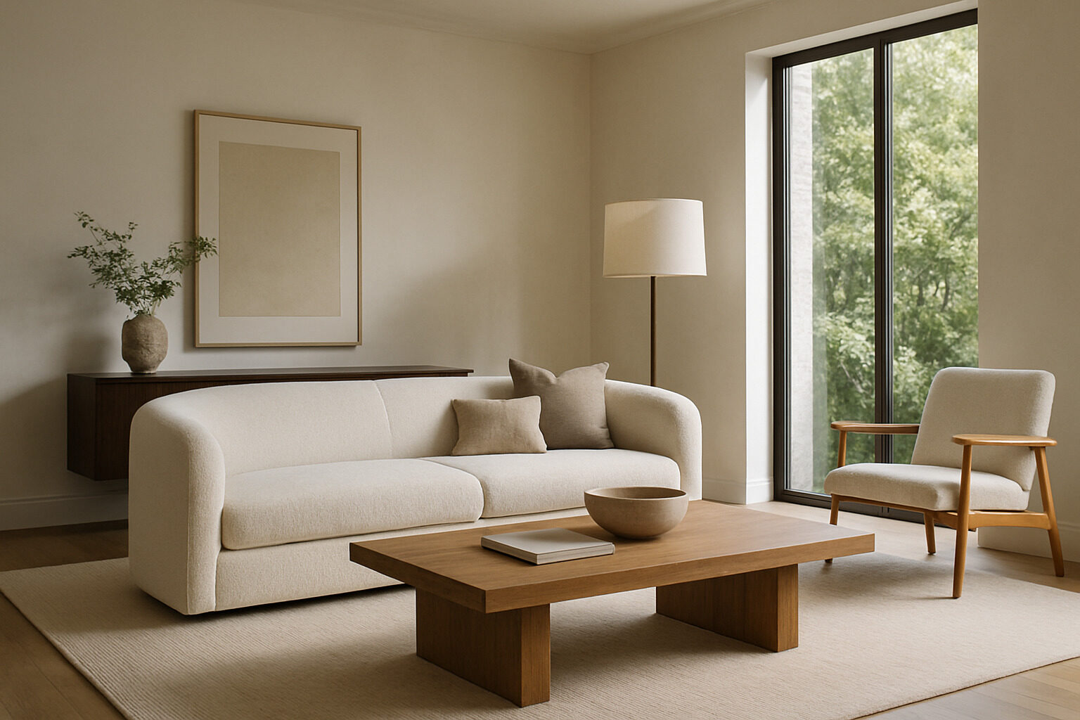
Every well-designed room you have ever saved to a moodboard is a lesson in interior design principles — if you know how to read it. Analyzing images is the fastest way to learn design because a photograph freezes the decisions: the palette, the scale of each piece, where the light comes from, and what your eye lands on first. Instead of memorizing abstract rules, you can reverse-engineer them from rooms that already work.
This guide explains the core principles of interior design through the lens of image analysis: what to look for in a reference photo, the questions to ask of it, and how to translate what you find into your own space.
Why Reading Images Beats Memorizing Rules
Design principles — balance, scale, rhythm, emphasis, harmony — sound vague in the abstract. In a photo they become concrete: balance is why the heavy sofa on the left is answered by the dark bookcase on the right; emphasis is why your eye goes to the fireplace first. Training yourself to name these moves in other people's rooms builds the judgment to make them in your own. Keep a folder of rooms you love, and analyze them one principle at a time using the sections below.
Restyle your own space with AI
Upload a photo of your room or home and see it reimagined in any style from this article. Your first restyle is free, no account needed.
Restyle My Space
Palette: The First Thing to Decode
Start every image analysis with color. Look for three layers:
- The dominant color — usually walls, large rugs, or major upholstery. It sets the room's temperature and mood.
- Secondary colors — wood tones, curtains, accent chairs. These add depth without competing.
- Accents — pillows, art, ceramics. Small doses of the boldest color in the room.
A classic guideline is a rough 60/30/10 split between these layers, but treat it as a diagnostic, not a law. When a reference photo feels calm, you will usually find a restrained dominant layer and accents drawn from a narrow family. When it feels energetic, the accent layer is louder or more scattered. Ask of any image: how many distinct colors are here, and which one is doing the emotional work?
Scale and Proportion: Measuring With Your Eyes
Scale is the relationship between objects and the room; proportion is the relationship between objects and each other. Photos teach both if you look for reference points. Compare the sofa to the wall behind it — does it command the wall or float on it? Check the coffee table against the sofa's seat height, the art against the furniture below it, the light fixture against the table it hangs over. Rooms that feel "off" in photos are very often scale problems: too many small pieces creating clutter, or one oversized item crowding everything else. When you find a photo that feels effortless, measure the relationships and note them; those ratios transfer to your own room even when the specific furniture does not.
Lighting: Find the Layers
Interior photographers and good designers both think in three layers of light, and you can spot each in a reference image:
- Ambient light — the overall wash, from windows or ceiling fixtures. Note where the daylight enters and how the room's orientation shapes its mood.
- Task light — reading lamps, counter lights, desk lamps, placed where activities happen.
- Accent light — the small pools that make a room feel layered at night: picture lights, candles, lamps on low surfaces.
Ask of the photo: what would this room look like at 9 p.m.? Images that glow usually have multiple small warm sources at different heights, not one bright overhead. That single observation upgrades more real-world rooms than any furniture purchase.
Focal Points and Sightlines
Every strong room photo has an obvious answer to "where do I look first?" — a fireplace, a window view, a bold artwork, a statement headboard. Notice how the rest of the room defers to that focal point: furniture angled toward it, palette quieter around it, lighting emphasizing it. Then notice the sightline the photographer chose, because it is usually the room's best axis — the view from the doorway or the seat you would actually use. When analyzing, ask: what is the anchor, and what has the designer removed so it can win?
Texture, Rhythm, and Balance
Once palette, scale, light, and focus are decoded, read the supporting principles. Texture is contrast between rough and smooth: linen against leather, wood against stone. Rhythm is repetition — a color or shape recurring across the room so your eye moves through it. Balance can be symmetrical (matched lamps flanking a bed) or asymmetrical (a tall plant offsetting a low bench), and photos make it easy to test: cover half the image and sense whether the remaining half feels heavier.
Negative Space: What the Photo Leaves Out
The hardest principle to learn from rules and the easiest to learn from images is restraint. In photos of rooms that feel expensive, count the empty surfaces: the clear stretch of console, the unhung wall, the floor visible around the rug. That negative space is not absence — it is what gives every object room to register. Compare a cluttered photo and a calm one of similar rooms, and you will usually find the difference is not what was added but what was removed. When you analyze a reference image, note not only the pieces but the gaps between them, and ask which of your own room's objects would need to disappear to achieve the same air.
A Quick Reference for Reading Any Room Photo
| Principle | What to Look For in the Image | Question to Ask |
|---|
| Palette | Dominant, secondary, and accent layers | Which color carries the mood? |
| Scale | Furniture vs. wall and ceiling height | What ratio makes this feel right? |
| Lighting | Ambient, task, and accent sources | How would this look after dark? |
| Emphasis | The first thing your eye lands on | What defers to the focal point? |
| Rhythm | Repeated colors, shapes, materials | What moves my eye through the room? |
| Balance | Visual weight left vs. right | Symmetrical or asymmetrical — and does it hold? |
Turn Analysis Into Action
Reading images is step one; the payoff is applying the principles to your own space. This is where AI closes the loop. Take a photo of your actual room and run it through our restyle tool, which re-renders the real space in a style you choose — you can watch how a new palette or material treatment changes the very room you analyzed, then compare the result against your reference images to see which principles shifted. If you have a folder of saved rooms but cannot name what unites them, the style quiz will put a label on your taste, and the AI designer can generate fresh interiors to practice your analysis on.
Do this with ten photos — five you love, five that feel wrong — and the principles stop being theory. You will start seeing palette layers, scale ratios, and lighting plans everywhere, which is exactly the point: interior design principles are not rules to obey but patterns to recognize, and images are where they hide in plain sight.
Restyle your own space with AI
Upload a photo of your room or home and see it reimagined in any style from this article. Your first restyle is free, no account needed.
Restyle My Space