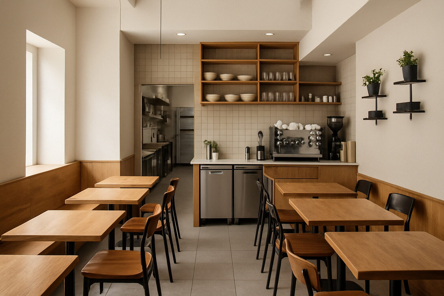
Maximizing space in a small cafe is not about squeezing in the most tables — it is about moving the most people through a comfortable experience. A cafe layout succeeds when three flows never collide: customers arriving and ordering, staff producing and serving, and guests seated and lingering. Get those flows right and a compact room can outperform a larger, badly organized one; get them wrong and no amount of extra seating rescues the daily traffic jam at the milk station. This guide walks through the zones, the counter, seating strategy, and the equipment adjacencies that make a small cafe work.
Everything below applies whether you are sketching a first concept, renovating an existing shop, or rearranging furniture on a Sunday night before reopening.
Start With Flow, Not Furniture
Before placing a single table, draw the customer journey as a line: door, queue, order point, pickup point, seating, and exit (with a stop at the condiment station and the restroom). The line should never cross itself, and it should not cross the path of staff bussing tables or restocking. Three rules of thumb keep the line healthy:
- The queue needs a home. Decide exactly where six waiting customers stand, and make sure they block neither the door nor seated guests. Along a wall or window is the classic solution; a queue that folds back on itself along the counter also works in deep, narrow rooms.
- Separate order from pickup. Even one meter of separation stops the collision between people paying and people collecting drinks — the single most common small-cafe bottleneck.
- Keep an emergency lane. One continuous route from door to counter to back-of-house should stay clear at the busiest moment of the day. If your plan only works when the shop is half-empty, it does not work.
Restyle your own space with AI
Upload a photo of your room or home and see it reimagined in any style from this article. Your first restyle is free, no account needed.
Restyle My Space
The Counter: Your Cafe's Engine Room
The counter placement decides everything else. Placing it facing the entrance, visible immediately on entry, shortens the arriving customer's decision time and naturally organizes the queue. Deep narrow spaces usually want the counter along a side wall, running front-to-back; wide shallow spaces want it across the rear, leaving the window zone for seating.
Behind the counter, sequence the workstations in the order of production so staff move in one direction: register, then espresso machine and grinders, then milk and finishing, then pickup. Under-counter refrigeration belongs directly beneath the milk-steaming position; the pastry case belongs beside the register where it sells itself to the queue; the dishwashing zone belongs at the far end, away from food and the customer's eye. In a small cafe, every step a barista does not take is capacity you did not have to build.
Equipment adjacency checklist
- Grinder within arm's reach of the espresso machine, no turning required.
- Milk fridge below or beside the steam wand position.
- Cups stored above or beside the machine, at eye level, not across the aisle.
- Water source and knock box inside the espresso work triangle.
- Pickup shelf or counter reachable by the barista without leaving the machine.
Seating: Density vs Comfort, Honestly Traded
Every seat type buys density at a price in comfort, or comfort at a price in density. Small cafes work best mixing three or four types deliberately rather than filling the room with identical two-tops:
| Seating type | Space efficiency | Comfort and dwell time | Best use in a small cafe |
|---|
| Window or wall counter with stools | Excellent | Low — solo, short visits | Rush-hour overflow, laptops facing the street |
| Small two-tops | Good | Medium | The flexible core; pair them for groups |
| Banquette along a wall | Very good — no chair clearance needed on one side | High | Maximizing one long wall; softens the room |
| Communal table | Good per seat | Medium — social or laptop-friendly | Center of the room; absorbs solos efficiently |
| Lounge chairs | Poor | Very high — long dwell | One corner only, as atmosphere rather than capacity |
A banquette is the small cafe's best friend: bench seating against the wall eliminates the pull-out clearance a chair needs, and tables in front of it can be nudged together or apart as party sizes change. Note that dwell time is a lever, not a flaw — comfortable seats fill the room and create atmosphere in slow hours, while counter and stool seating keeps turnover brisk at peak. Decide which economy your cafe runs on before choosing the mix.
Zone the Room, Even a Tiny One
Rooms feel larger when they contain distinguishable places. Even in a very small footprint you can define three zones: a fast zone near the counter and door (stools, standing ledge, grab-and-go), a social zone in the middle (two-tops, communal table), and a slow zone in the deepest, quietest corner (banquette, softer light). Signal the zones with lighting — brighter over the counter, warmer and dimmer in the slow corner — plus a rug, a material change, or a planter line rather than walls. Zoning also protects the experience: laptop campers drift naturally to the slow corner instead of occupying the turnover seats by the door.
Small-Space Multipliers
- Go vertical. Shelving above head height for retail bags and dry stock frees floor storage; a high shelf line also draws the eye up and makes low ceilings feel taller.
- Choose furniture that moves. Light chairs, stackable stools, and tables on quality glides let one layout serve the morning rush and the afternoon lull.
- Use mirrors and glass deliberately. A mirror along the queue wall visually doubles the room and lets seated guests people-watch.
- Shrink the table, not the aisle. Guests forgive a small tabletop; they do not forgive being bumped. When forced to choose, protect circulation width.
- Design the threshold. An A-board, window seating visible from the street, and a clear view to the counter turn the facade into your busiest marketing asset.
Test the Layout Before You Build It
Paper plans lie about how rooms feel. Tape the counter and tables out on the floor at full size and walk the three flows — customer, staff, bussing — with a friend playing the opposing role. Then test the look: photograph your space and run it through our AI restyle tool to see the room re-rendered with different layouts, materials, and moods before committing to millwork. If you are converting an existing storefront and want to understand the architectural bones you are working with — window rhythm, structural walls, ceiling character — our architecture analyzer reads a photo and identifies the features worth designing around. The same zoning instincts apply at home, too; see our mudroom layout tips for the domestic version of hardworking small-space planning.
A maximized cafe is not the one with the most chairs — it is the one where the queue never tangles, the barista never backtracks, and every seat type is doing the job it was chosen for. Plan the flows, sequence the counter, mix the seating honestly, and the square footage you have will feel like more than it is.
Restyle your own space with AI
Upload a photo of your room or home and see it reimagined in any style from this article. Your first restyle is free, no account needed.
Restyle My Space