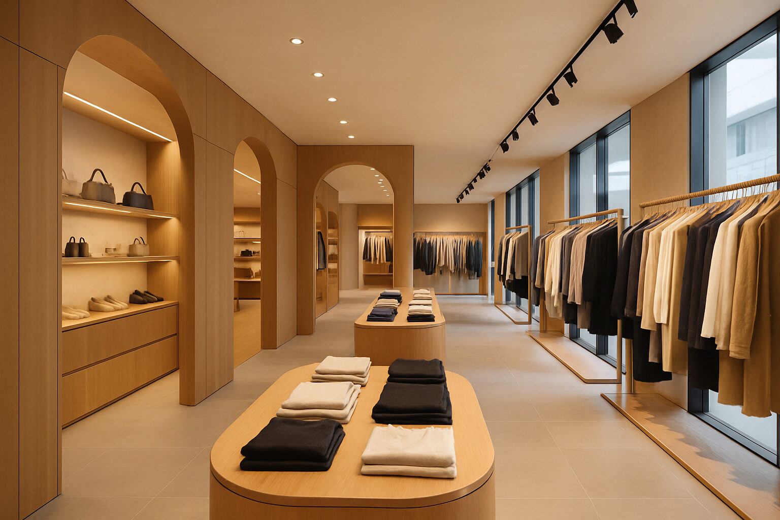
Store interieurs — retail interiors — are among the most consequential designed spaces in commerce: every meter of layout, every sightline and every lighting decision influences whether a visitor browses, buys or walks out. Unlike homes or offices, a store interior has a measurable job. It must attract people in from the street, orient them instantly, guide them past merchandise in a deliberate sequence, and make the goods irresistible — all while feeling effortless.
The good news is that retail design rests on a set of well-established principles: proven layout patterns, the psychology of thresholds and sightlines, layered lighting, and material choices that support the brand while surviving heavy use. This guide covers each principle and how they combine into a store that works.
The Decompression Zone: The First Five Steps
Customers entering a store from a busy street need a transition. Retail designers call the first few meters inside the door the decompression zone: the stretch where a visitor slows down, adjusts to the light and temperature, and takes stock of the room. Merchandise, signage and staff approaches placed in this zone are largely wasted — people simply do not register them while transitioning.
The principle: keep the entry zone open and legible. Let it present the store's identity — a material moment, a hero display seen at a distance, clear sight into the space — rather than product density. Related is the widely observed tendency of shoppers in many Western markets to drift rightward after entering; whatever the direction in your context, the wall customers meet first deserves your strongest presentation, which is why retailers call it the power wall.
Restyle your own space with AI
Upload a photo of your room or home and see it reimagined in any style from this article. Your first restyle is free, no account needed.
Restyle My Space
Choose the Right Layout Pattern
Almost every store interieur is a variation on a handful of layout archetypes, each with distinct strengths:
- Grid: parallel aisles at right angles, familiar from supermarkets and pharmacies. Maximum capacity and easy navigation for mission shopping, but low inspiration.
- Racetrack (loop): a defined main path circulating the whole floor, with departments opening off it. Excellent exposure — customers pass everything — used widely in department and furniture stores.
- Free-flow: fixtures arranged organically, encouraging wandering and discovery. Favored by fashion and lifestyle brands; lower density, higher dwell time.
- Boutique / gallery: few products, generous space, museum-like presentation. Signals premium positioning; the interior itself does much of the selling.
Hybrids are common — a grid core with a free-flow front, or a loop with gallery moments. The choice should follow the shopping mission: efficiency-driven categories want grids; browse-driven categories want loops and free-flow.
Sightlines, Focal Points and Wayfinding
Customers navigate stores with their eyes before their feet. Strong store design composes sightlines deliberately: from the entrance, a visitor should see a focal point deep in the store — a lit feature wall, a styled display, a striking fixture — that pulls them inward. Within the floor, fixture heights are graded: low tables and gondolas in the center so the eye travels across them, taller fixtures and wall systems at the perimeter.
Every aisle or path should terminate in something worth walking toward; dead ends and blank walls stop momentum. Wayfinding then works in layers — architecture first (paths, floor changes, ceiling elements), then lighting, then signage as the final clarifier. If customers need many signs to find their way, the layout is doing too little work.
Lighting: The Hardest-Working Tool in Retail
Nothing transforms a store interieur faster than lighting. Retail lighting is layered like hospitality lighting, but with sharper contrast between layers:
- Ambient: comfortable general illumination that sets the brand tone — bright and even for value positioning, lower and moodier for premium.
- Accent: the sales layer. Spotlights on merchandise at noticeably higher intensity than ambient light create the pop that draws the eye; the greater the contrast, the more theatrical the effect.
- Perimeter: washed walls stretch the space and pull customers to the edges, where the deepest stock usually lives.
Color quality is critical: high color-rendering sources keep fabric, food and skin tones honest, and consistent color temperature prevents the patchwork look. Fitting rooms deserve the best light in the building — flattering, vertical, shadow-free — because that is where clothing decisions are actually made.
Materials, Fixtures and Brand Expression
Materials carry the brand story at arm's length. Raw concrete, steel and reclaimed timber tell one story; lacquer, stone, brass and glass tell another. The principles are constancy and contrast: a tight material palette repeated throughout builds identity, while a deliberate contrast — one refined material in a raw shell, or one raw material in a polished room — creates memorability.
Practical performance is non-negotiable. Floors must take relentless traffic (porcelain, polished concrete, hard-wearing timber), fixtures must be adjustable as merchandising changes weekly, and everything at customer height must tolerate touch. The best fixture systems are quiet servants: flexible, robust and visually recessive, so the product remains the hero. Architecture and shell character matter too — heritage storefronts, arches and high ceilings are assets worth exposing rather than covering; our overview of European architecture styles is a useful reference when working with an older building's bones, and our Architecture Explorer can identify a building's style from a photo before you plan the fit-out.
The Checkout and the Final Impression
The transaction zone deserves as much design attention as the entrance, because it delivers the last impression a customer carries out the door. Position counters where they are visible once a customer decides to buy but not dominating the view on entry, keep queue paths generous and lined with considered impulse merchandising rather than clutter, and give staff a workspace that stays tidy by design — concealed storage, cable management, a back counter for wrapping.
Increasingly, checkout is dissolving into the floor: mobile points of sale let staff complete purchases anywhere, which frees layout options and removes the queue as a visual barrier. Whichever model you choose, the principle holds — the final meters of the journey should feel as intentional as the first, sending customers out with the same impression of care the window promised.
Layout Patterns Compared
| Layout | Best for | Strengths | Trade-offs |
|---|
| Grid | Supermarkets, pharmacies | High capacity, fast navigation | Low inspiration, monotonous |
| Racetrack / loop | Department, furniture stores | Full-floor exposure, guided journey | Longer trips can frustrate mission shoppers |
| Free-flow | Fashion, lifestyle, gifts | Discovery, dwell time, flexibility | Lower density, needs strong visual order |
| Boutique / gallery | Premium and luxury | Brand theater, product focus | Lowest capacity per square meter |
Bringing the Principles Together
A successful store interieur is a sequence, not a collection of features: a calm threshold, a compelling first wall, a layout matched to the shopping mission, sightlines that pull, lighting that sells and materials that speak the brand. When refreshing an existing store, start by photographing it from the entrance and asking what a first-time visitor's eye actually meets — then experiment. You can preview alternative material and style directions for a retail space by uploading a photo to our AI restyle tool, and if you are still defining the brand's aesthetic language, the Style Finder is a fast way to give it a name. Retail rewards intentionality: every element either moves a customer toward the product or gets in the way, and great design simply removes everything that gets in the way.
Restyle your own space with AI
Upload a photo of your room or home and see it reimagined in any style from this article. Your first restyle is free, no account needed.
Restyle My Space