Symmetrical buildings have been architectural marvels for centuries, combining form and function to create visually striking and structurally sound edifices. This article explores 6 famous symmetrical buildings from different eras and locations:
- The Parthenon (Greece)
- Taj Mahal (India)
- St. Peter's Basilica (Vatican City)
- Palace of Versailles (France)
- Sydney Opera House (Australia)
- Lotus Temple (India)
These structures showcase how symmetry:
- Balances design elements
- Reflects cultural values
- Enhances aesthetic appeal
For each building, we'll cover:
- Construction period and purpose
- Symmetrical features
- Architectural significance
Quick Comparison:
| Building | Location | Built | Key Symmetrical Feature |
|---|---|---|---|
| Parthenon | Greece | 447-438 BC | Golden ratio design |
| Taj Mahal | India | 1632-1653 | Mirrored sides and minarets |
| St. Peter's Basilica | Vatican City | 1506-1626 | Greek cross plan |
| Palace of Versailles | France | 17th-18th century | Central axis layout |
| Sydney Opera House | Australia | 1959-1973 | Interlocking shell structures |
| Lotus Temple | India | 1986 | 27 marble "petals" in groups of 3 |
Symmetry in architecture offers:
- Improved structural integrity
- Easier navigation for visitors
- Visual harmony and balance
However, symmetrical designs can also present challenges in maintenance and flexibility of use.
Related video from YouTube
The Parthenon, Greece

The Parthenon is the poster child for symmetrical architecture. Sitting on Athens' Acropolis, this 5th century BC temple to Athena is peak classical Greek design.
Quick Facts:
- Built: 447-438 BC
- Size: 70 x 30 meters (2,170 sq meters)
- Architects: Ictinos and Callicrates
But it's not just about looks. The Parthenon's symmetry is baked into its DNA. The golden ratio (9:4 height-to-width) gives it that "just right" feel.
What makes it special?
- Curved columns and entablature (no straight lines here)
- Columns with a slight belly (to trick your eye)
- All Pentelicon marble, no mortar needed
The Parthenon's influence? It's everywhere. From the U.S. Capitol to the British Museum, its DNA is in buildings worldwide.
"The Parthenon is the basis of all measurement in art... You belong to it." - Le Corbusier
This isn't just a pretty face. The Parthenon's symmetry reflects ancient Greek values: balance, order, harmony. It's a 2,500-year-old lesson in design that still packs a punch today.
2. Taj Mahal, India
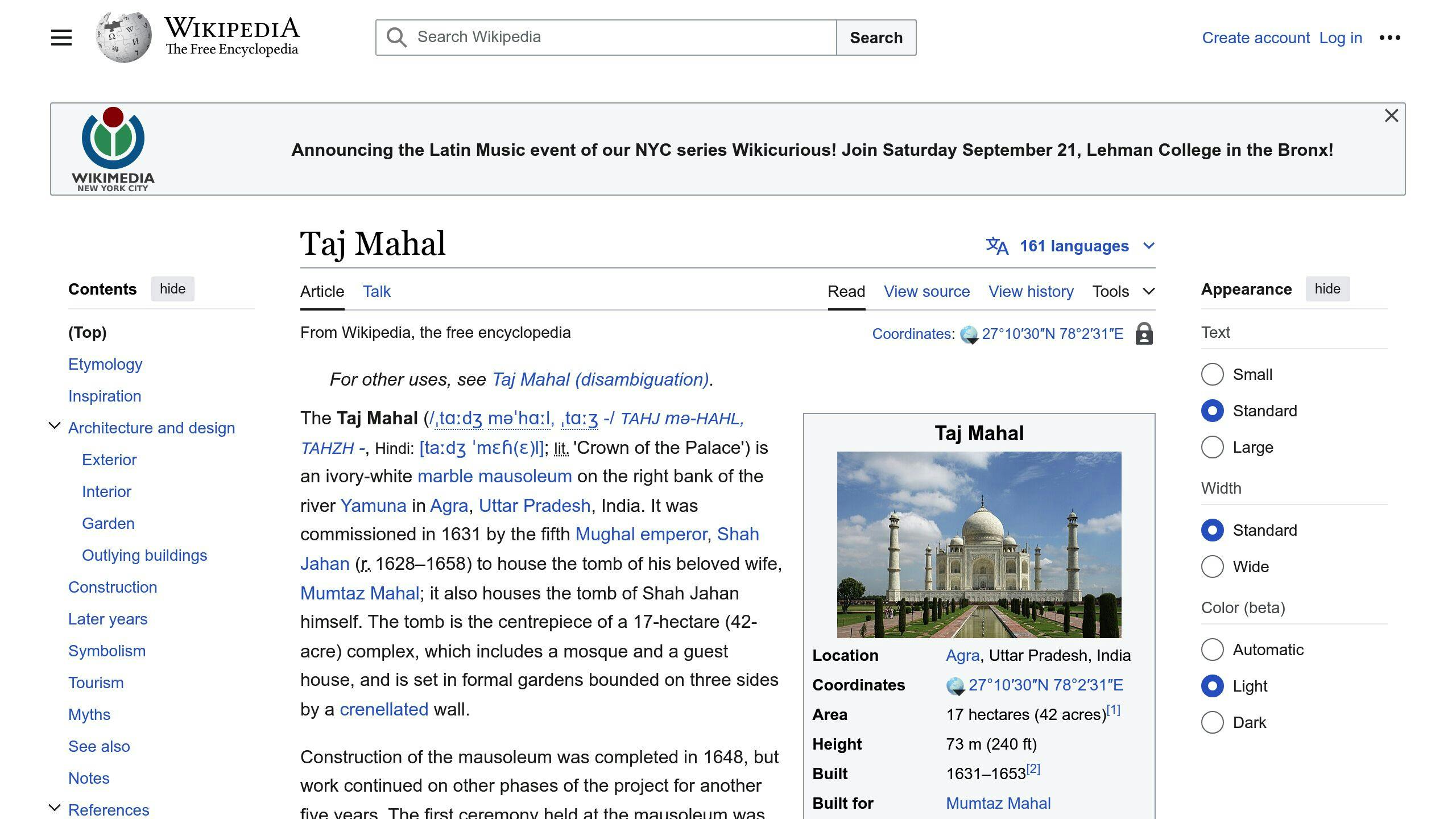
The Taj Mahal is a masterpiece of symmetry. Built in Agra from 1632 to 1653, this white marble monument took 22 years to complete.
Its symmetry is striking:
- Four identical minarets frame the main structure
- Perfectly mirrored sides
- Central dome with smaller domes on each side
But it's not just about looks. The Taj's symmetry reflects Islamic art and Mughal design principles. Even the gardens and waterways are symmetrical.
Shah Jahan, the Mughal emperor, went all out. He used 22,000 workers and 1,000 elephants to build this tribute to his wife, Mumtaz Mahal.
What makes it special?
- Detailed marble inlay work
- Mix of Persian, Islamic, and Indian styles
- Clever use of optical illusions
The Taj's influence on architecture is massive. It attracts about 8 million visitors each year.
"The Taj Mahal is almost a sensory overload. It is a 'rhythmic combination of solids and voids, concave and convex, and light shadow.'" - UNESCO
This quote nails it. The Taj's symmetry creates a visual rhythm that's hard to beat.
Here's a fun fact: The Taj has a twin building on its grounds. There's a mosque on one side and an identical "dummy" building on the other - just to keep things symmetrical!
The Taj Mahal shows how symmetry can create timeless beauty. It's a 400-year-old lesson in balance and harmony.
3. St. Peter's Basilica, Vatican City
St. Peter's Basilica is a masterpiece of symmetry in religious architecture. Built from 1506 to 1626, this massive church blends Renaissance and Baroque styles.
The basilica's symmetry shines through its design:
- Greek cross plan
- Central dome with smaller domes on each side
- Balanced façade
Donato Bramante started with a perfectly symmetrical Greek cross design. Later architects, including Michelangelo, tweaked the plan but kept its balanced look.
Some key measurements:
- Nave: 211.5 meters long
- Inner dome: 42 meters wide
- Dome height: 120 meters
The basilica is HUGE:
| Feature | Measurement |
|---|---|
| Area | 22,000 square meters |
| Capacity | 60,000 people |
| Outer dome width | 59 meters |
This symmetry isn't just for looks. It highlights the church's role as the heart of Roman Catholicism. The balanced design pulls your eyes up, connecting earth and heaven.
Art historian Dr. Steven Zucker sums it up:
"It is the most magnificent, biggest church in all of Christendom."
The symmetry doesn't stop at the walls. St. Peter's Square, designed by Bernini, has twin colonnades that welcome visitors. This balanced approach creates a sense of unity.
Inside, Bernini's bronze baldachin sits right under the dome, marking the church's center. It's a perfect example of using symmetry to guide the eye in a huge space.
St. Peter's Basilica shows how symmetry can create awe and spiritual uplift. Its balanced design has wowed architects and visitors for centuries, making it a standout among symmetrical buildings worldwide.
4. Palace of Versailles, France

The Palace of Versailles is a masterpiece of symmetry in French Baroque architecture. What started as Louis XIII's hunting lodge became a grand palace under Louis XIV.
Here's what makes Versailles so symmetrical:
- It's built along a central axis, splitting the palace in half
- The King's rooms are in the middle, with the Queen's to the south
- The gardens, designed by André Le Nôtre in 1662, are all about geometric patterns
The Hall of Mirrors, finished in 1684, is symmetry at its finest:
| Feature | Number |
|---|---|
| Length | 73 meters |
| Mirror arches | 17 |
| Matching windows | 17 |
| Total mirrors | 357 |
This isn't just a pretty room - it's a show of French power and art.
The symmetry doesn't stop at the walls. The 800-hectare park has:
- Straight paths
- Matching pavilions
- Big fountains
Architects Louis Le Vau, Jules Hardouin-Mansart, and designer André Le Nôtre created this mix of French Baroque and Neoclassical styles. Even the Royal Opera, added in 1770, fits right in with the symmetrical design.
But Versailles isn't just about looking good. Its symmetry reflects the idea of absolute monarchy, with the king at the center of everything. It's architecture with a message: the French monarchy is in charge.
sbb-itb-1be9014
5. Sydney Opera House, Australia

The Sydney Opera House is a modern marvel of symmetry in architecture. Danish architect Jørn Utzon designed this iconic structure in 1957, and it opened in 1973.
What makes the Opera House's symmetry unique? It's all about the shells:
- Interlocking concrete "sails" form the roof
- Large, shell-like structures create a striking look
- Shells vary in size and angle, but keep the same shape
Utzon used "similarity symmetry" in his design. He explained:
"The shells differ in size and inclination to form a sphere segment, although the shell shape remains unchanged."
This approach creates a building that looks both balanced and dynamic, seeming to float above Sydney Harbour.
But the symmetry isn't just skin-deep:
| Feature | Purpose |
|---|---|
| Seawater cooling | Uses harbor water for climate control |
| Daylighting | Maximizes natural light use |
| Pre-cast rib system | Supports the shells |
Want to capture the Opera House's symmetry in photos? Try these tips:
- Shoot at different times to catch changing light
- Use harbor reflections for mirror-like effects
- Focus on the tiled exterior for repeating patterns
The Sydney Opera House shows that symmetry can be bold and subtle, pushing limits while staying balanced.
6. Lotus Temple, India

The Lotus Temple in New Delhi is a stunning example of symmetrical architecture with deep spiritual roots. Built in 1986 by Iranian architect Fariborz Sahba, this Bahá'í House of Worship is a major attraction.
Here's what makes it special:
- 27 marble "petals" in groups of three
- 9 sides and 9 doors leading to a central hall
- 3 levels of 9 petals each
The temple's symmetry isn't just for looks. It represents the Bahá'í Faith's ideas of unity and inclusiveness. Sahba explained:
"The lotus represents the Manifestation of God, and is also a symbol of purity and tenderness. Its significance is deeply rooted in the minds and hearts of the Indians."
Two key features stand out:
1. Light
Natural light floods the central hall through a skylight.
2. Water
Nine pools around the building make it look like a floating lotus.
The temple's design has won awards and broken records:
- Aga Khan Award for Architecture (1989)
- Guinness World Record for most visited building (2001)
For visitors:
- It's open to all faiths
- Can hold 2,500 people
- Displays scriptures from various religions
Remember:
- Take off your shoes
- Stay quiet inside
- Dress modestly
The Lotus Temple shows how symmetry in architecture can create a space that's both beautiful and meaningful.
Good and Bad Points
Let's look at the pros and cons of some famous symmetrical buildings:
| Building | Pros | Cons |
|---|---|---|
| The Parthenon | - Perfect symmetry - Golden ratio design - Built to last |
- Small inside - Weather damage - Needs fixing |
| Taj Mahal | - Complex symmetry - Cool reflecting pools - Mix of styles |
- Expensive upkeep - Too many visitors - Marble turning yellow |
| St. Peter's Basilica | - Awesome dome - Fits 60,000 people - Lots of art |
- Took forever to build - Tricky structure - Can feel too big |
| Palace of Versailles | - Matching gardens and front - Fancy inside - Big in history |
- Costs a ton to run - Super crowded - Energy hog |
| Sydney Opera House | - Unique symmetry - Looks cool - Sounds great |
- Went way over budget - Roof's a pain to fix - Not flexible inside |
| Lotus Temple | - 27 marble "petals" - Lets in natural light - Open to everyone |
- Only fits 2,500 - Strict rules - Hard to clean |
These buildings often use the golden ratio - a design trick that makes things look good. As architect Le Corbusier said:
"rhythms apparent to the eye and clear in their relations with one another. And these rhythms are at the very root of human activities. They resound in Man by an organic inevitability, the same fine inevitability which causes the tracing out of the Golden Section by children, old men, savages, and the learned."
Basically, symmetry just "clicks" with people.
But here's the thing: while symmetry looks great, it can be a headache to maintain and use. The trick is finding a balance between looking good and working well.
Wrap-up
Symmetry in architecture isn't just about looks. It's a tool that shapes how we see and feel in spaces. Here's what we've learned about symmetrical buildings:
1. Balance and harmony
Symmetry brings order. Think of the Taj Mahal or Parthenon. Their mirrored parts create a whole that just feels right.
2. Space perception
Symmetrical designs can make rooms feel bigger and more organized. Interior designers use this trick to transform small spaces.
3. Psychological impact
Balanced spaces can make us feel calm. Neuroscientist Semir Zeki puts it this way:
"Beauty must be a central element. Its experience adds to the health of its individuals and thus to society's wellbeing. It is not a luxury, but an essential ingredient in nourishing the emotional brain."
4. Practical benefits
Symmetry can make buildings work better. St. Peter's Basilica uses a symmetrical layout to handle big crowds.
5. Cultural significance
Many cultures love symmetry in buildings. The Lotus Temple in Delhi, with its nine matching "petals", shows this universal appeal.
6. Challenges
Keeping symmetrical designs perfect can be tough. The Palace of Versailles needs constant work to stay symmetrical.
7. Modern takes
Today's architects often mix things up. They blend symmetry with asymmetry for unique designs. The Sydney Opera House does this with its symmetrical shells arranged asymmetrically.
In short, symmetry in architecture is more than just a pretty face. It's a powerful tool that shapes our experiences and emotions in built spaces.
FAQs
What building in the world has symmetry?
The Taj Mahal in Agra, India is a prime example of symmetry in architecture. It's got identical chambers and passageways on both sides of a central hall. This creates a stunning, balanced look that's hard to miss.
Would a better structure be symmetrical or asymmetrical?
Symmetrical buildings often have an edge over asymmetrical ones, especially when it comes to staying strong. Here's why:
- They handle earthquakes better
- T-shaped buildings (which are asymmetrical) don't do as well with seismic loads
- During earthquakes, the first floor of symmetrical buildings usually moves less than the top floor
What are the advantages of symmetrical design?
Symmetrical design brings a lot to the table:
| Advantage | What it means |
|---|---|
| Balance | Looks good to the eye |
| Easy to navigate | People can find their way around more easily |
| Natural flow | Your eyes move smoothly through the design |
| Stronger structure | Holds up better under stress, like during earthquakes |
| Feels familiar | Our brains like patterns, so we're drawn to symmetry |
These perks make symmetrical design a go-to in architecture and other fields. It's not just about looking good - it's practical too.
