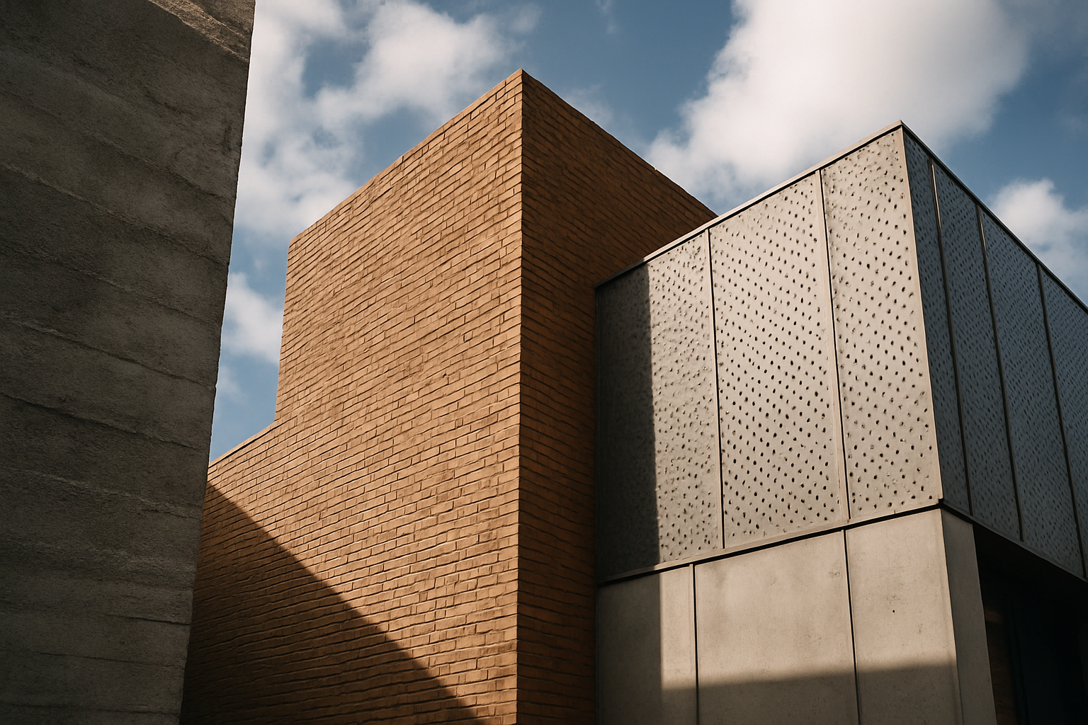
Texture impacts building design more than almost any quality we rarely discuss. It governs how a building feels to the hand, how it plays with light across a day, how big it appears, how it weathers over decades, and how trustworthy or cheap it seems at a glance. Two buildings of identical shape — one in rough board-formed concrete, one in polished glass — are entirely different architectural experiences, and texture is the difference. Designers who master it control not just how a building looks, but how it is touched, approached, photographed, and remembered.
This article breaks down what architectural texture actually is, how it works on our senses, its practical roles in scale and weathering, how the great styles used it, and how to evaluate texture in buildings around you.
What Texture Means in Architecture
Architectural texture operates at two levels. Tactile texture is the physical relief of a surface — the tooth of brick, the grain of sawn timber, the ripple of hand-troweled plaster — perceptible by touch and by raking light. Visual texture is pattern read as texture at a distance: a facade of many small windows, a wall of shingles, a screen of terracotta fins. A skyline reads the city's texture; a hand on a door reads the material's. Good buildings compose both, so that the facade that intrigues from across the street continues to reward at arm's length.
Crucially, texture is information. Rough surfaces tell us about mass, craft, and age; smooth ones about precision, technology, and control. We read those messages instantly and mostly unconsciously, which is why texture choices carry so much of a building's character.
How Texture Works on Our Senses
Touch is the intimate channel. Humans explore valued objects with their hands, and buildings are no exception: rails, handles, counters, and the wall beside a bench are all read by skin. Materials with warm, varied textures — wood, brick, stone, leather, bronze — invite this contact and reward it; cold or featureless surfaces discourage it. Research on sensory experience broadly suggests that people judge environments more positively when materials offer tactile warmth and variety, and that natural materials in particular are associated with comfort and calm — one thread of the biophilic effects we discuss in the psychology of architectural aesthetics.
Light is the amplifier. Texture only exists visually because light grazes it: a rough stone wall is a drama of shadow at sunrise and nearly flat at noon. This makes textured buildings time-keepers — their appearance shifts with the sun's angle — while perfectly smooth buildings look much the same at all hours. Architects orient and sculpt textured surfaces precisely to harvest this changing light.
Texture, Scale, and Distance
Texture is also a scaling device. Fine texture — small bricks, shingles, delicate moldings — breaks a large surface into countable units, making buildings feel smaller, friendlier, and more human-scaled. Coarse texture — massive rusticated blocks, deep precast ribs — enlarges apparent scale and adds gravity. Classical architects codified this intuition: heavily rusticated ground floors expressing strength at the street, with progressively smoother, finer surfaces above. The result is a facade that addresses the pedestrian with richness and the skyline with clarity.
The corollary is one of the most common failures in contemporary building: texture designed only for the rendering. A facade that reads beautifully at drone distance can be a dead expanse at the sidewalk if it offers nothing at hand scale. The old rule of thumb holds — provide texture at every distance from which the building will actually be experienced.
Texture Across the Styles
| Style | Signature textures | Effect sought |
|---|---|---|
| Romanesque and Gothic | Rough-hewn and carved stone, deep moldings | Mass, mystery, shadowed depth |
| Baroque | Sculpted relief, gilded plaster, contrast of polish and shadow | Drama and movement |
| Victorian | Patterned brick, shingle, terracotta, turned wood | Richness, variety, domestic exuberance |
| Modernism | Smooth stucco, glass, steel; later board-formed concrete | Precision, honesty, machine clarity |
| Brutalism | Raw concrete bearing its formwork grain | Frankness and monumental weight |
The table's arc tells a story: texture-rich traditions like the Victorian and Baroque treated surface as an opportunity, early modernism treated it as a distraction to be purged, and later movements rediscovered it — often through concrete that proudly displays the texture of the wooden forms it was cast in. Few pendulum swings in architecture are as legible on the surface of the buildings themselves.
Texture Indoors: Sound and Atmosphere
Inside a building, texture takes on a second job: acoustics. Hard, smooth surfaces reflect sound, producing the bright reverberance of a marble lobby or the fatiguing clatter of a glass-walled restaurant; soft and irregular surfaces absorb and scatter it, producing hush. Much of what we experience as a room's atmosphere is texture heard rather than seen — the calm of a library with its books, wood, and carpet, versus the echo of an empty concrete stairwell. Designers tune this deliberately, pairing hard textures where they want energy and ceremony with absorbent ones where they want intimacy and conversation. Texture also carries maintenance meaning indoors: surfaces that show wear warmly, like waxed wood floors, accumulate hospitality, while surfaces that show wear as damage demand constant renewal to avoid reading as tired.
Texture and Time: Weathering as Design
Texture determines how buildings age. Rough, absorbent, variegated materials — stone, brick, timber, copper — tend to weather gracefully: rain-streaking, moss, and patina settle into the surface's existing variety and read as character. Smooth, uniform surfaces have nowhere to hide a stain; every streak on white render or mirrored glass reads as neglect. Designers who think in decades choose textures that will collaborate with weather rather than fight it, detailing drips and copings to steer water where its marks will flatter.
This is also an economic argument. A building whose surfaces improve with age accrues affection and maintenance patience; one that must look factory-new to look acceptable is condemned to perpetual cleaning or gradual shabbiness. Much of what we call the charm of old towns is simply texture that has spent a century getting better.
Evaluating Texture Like a Designer
- Test the three distances. Does the building offer something to the eye from a block away, across the street, and at arm's length?
- Watch the light move. Visit or picture the facade in morning and evening sun; texture that never casts a shadow is decoration, not relief.
- Follow the hand. Check what the building gives you to touch at doors, rails, and seats — this is where texture becomes hospitality.
- Imagine the rain. Ask where water will run and what the surface will look like after twenty years of it.
- Check the contrast budget. The strongest effects come from juxtaposition — rough against polished, matte against glossy — not from uniform roughness everywhere.
Then practice on real buildings. Upload a photo of a facade you love — or one that leaves you cold — to our AI building analyzer and study how its materials and surface treatment contribute to the verdict. Texture is where architecture stops being an image and becomes a physical companion; buildings that understand this are the ones we reach out and touch.